Modals
Modal boxes are a frequently utilized for login/register forms, advertisements, pop-outs of information, or just notifications to the user.
We're going to be creating a modal using HTML, CSS, and JavaScript.
Note: We are going to be hard coding the content of this modal, however, the text can be replaced with variables and messages that can change. Example:
X has won this round!/O has won this round!

Setup
<!doctype html>
<html lang="en">
  <head>
    <meta charset="UTF-8" />
    <link rel="icon" type="image/svg+xml" href="/vite.svg" />
    <meta name="viewport" content="width=device-width, initial-scale=1.0" />
    <title>Modal Practice</title>
    <link rel="stylesheet" href="style.css" />
    <script defer src="app.js"></script>
  </head>
  <body></body>
</html>
body {
  background-image: url("https://s-media-cache-ak0.pinimg.com/originals/5c/7a/93/5c7a9388fd4cb59fcbb9fedc5fa12bd3.jpg");
  background-repeat: no-repeat;
  background-attachment: fixed;
  background-position: center;
}
Exercise
Let's pretend that we are making the card game: Bridge. We want a modal to pop up to show information about the game.
-
When a user clicks on the button
About the Game, a modal will pop up to show them information about how to play the game. -
Once open, there will be a way to close the modal so that the user can see the main page again.
Add the HTML Elements
- Add a button that we will use to open the modal
<button id="openModal">About the Game</button>
- give it the text
About the Game
- Add a dialog which will be the modal. Give an an id of
modalso we can refer to it later. Theopenattribute will auto show the dialog
<dialog id="modal" open></dialog>
- Add the elements that will go inside the modal
<dialog>:
-
A button to close the modal with the text
Close. It has to be inside a<form method="dialog"></form>in order for it to work.<form method="dialog">
<button id="close">Close</button>
</form> -
A header tag for the modal's header with the text
Learn to Play Bridge<h1>Learn to Play Bridge</h1> -
Three paragraphs with text inside the box. Feel free to use lorem ipsum text or, for more authentic text, take some from this bridge website
<p>
Bridge is played with four people sitting at a card table using a standard
deck of 52 cards (no jokers). The players across from each other form
partnerships as North-South and East-West.
</p>
<p>
Draw cards to select the person to deal the cards (the dealer). This person
distributes the cards face down, in clockwise rotation one at a time, until
each player at the table has a hand consisting of 13 cards.
</p>
<p>
After the play of each deal is completed, the opportunity to deal moves around
the table clockwise so that each person has a turn to deal out the cards.
</p>
- Wrap the
<a>,<h1>, and the three<p>in another div. Give this div an id ofmodal-textboxso we can refer to it later
♠️ HTML At This Point
<button id="openModal">About the Game</button>
<dialog id="modal" open>
<div id="modal-textbox">
<form method="dialog">
<button>Close</button>
</form>
<h1>Learn to Play Bridge</h1>
<p>
Bridge is played with four people sitting at a card table using a standard
deck of 52 cards (no jokers). The players across from each other form
partnerships as North-South and East-West.
</p>
<p>
Draw cards to select the person to deal the cards (the dealer). This
person distributes the cards face down, in clockwise rotation one at a
time, until each player at the table has a hand consisting of 13 cards.
</p>
<p>
After the play of each deal is completed, the opportunity to deal moves
around the table clockwise so that each person has a turn to deal out the
cards.
</p>
</div>
</dialog>

Style your Modal
Add some styling to our modal to set it apart when we press the About the Game button.
In the css sheet, give #modal some properties:
#modal {
background-color: rgba(0, 0, 0, 0.4);
position: fixed;
top: 0;
left: 0;
height: 100%;
width: 100%;
z-index: 1;
/*This puts our modal in front of the body (which has a default z-index setting of `0`*/
overflow: auto;
/*If overflow is clipped, a scroll-bar should be added to see the rest of the content*/
}

Style the Modal Text Box
#modal-textbox {
background-color: white;
height: 350px;
width: 550px;
border-radius: 2px;
}

Give the text box some margins so that it starts to center itself on the page and some depth so it stands out a little.
margin: 150px auto;
/*This will set the margins for the top and the bottom to 150px (or larger). The right and left will automatically set themselves (and keep the box centered horizontally).*/
box-shadow: 0 2px 2px rgba(0, 0, 0, 0.2);
/*This will give the box some depth.*/
♠️ CSS At This Point
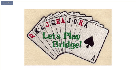
body {
background-image: url("lets-play-bridge.jpg");
background-repeat: no-repeat;
background-attachment: fixed;
background-position: center;
}
#modal {
background-color: rgba(0, 0, 0, 0.4);
position: fixed;
top: 0;
left: 0;
height: 100%;
width: 100%;
z-index: 1;
overflow: auto;
}
#modal-textbox {
background-color: white;
height: 350px;
width: 550px;
border-radius: 2px;
margin: 150px auto;
box-shadow: 0 2px 2px rgba(0, 0, 0, 0.2);
}

Hide the Modal
Now that the modal is styled, let's hide it.
- In the html file, on the
dialog, remove theopenattribute:
We will open the dialog dynamically by adding a dialog.showModal() in our event handler that on the About the Game button in our javascript file.

Hide and Show your Modal
- In your
app.jsfile, grab the three pieces we'll need:About the Gamebutton, the modal, and theclosebutton.
// Grabbing About the Game button
const $openBtn = document.querySelector("#openModal");
// Grabbing modal element
const $modal = document.querySelector("#modal");
// Grabbing close button
const $closeBtn = document.querySelector("#close");
- Set an event listener on the About the Game button.
//Add event listener to About the Game button
$openBtn.addEventListener("click", openModal);
- Create an event handler to display the modal. This needs to be placed above the listener.
For the modal to display, we need to call the showModal() method of the dialog
// Event handler to open the modal
const openModal = () => {
$modal.showModal();
};
We should now be able to open and close the modal with clicks to the associated buttons.
♠️ JavaScript At This Point
//Grabbing Elements
const $openBtn = document.querySelector("#openModal");
const $modal = document.querySelector("#modal");
const $closeBtn = document.querySelector("#close");
//Event Handlers
const openModal = () => {
$modal.showModal();
};
//Event Listeners
$openBtn.addEventListener("click", openModal);
Automatically Have Modal Show
What if we wanted to have the modal automatically show after 5 seconds of someone visiting our page?
We could set something to automatically run our openModal function.
- Make a setTimeout for the modal to automatically pop-up after 5 seconds.
setTimeout(openModal, 5000);
Format the Information Inside the Modal
Reorganize the code in our Modal Text Box and format it to look a little nicer.
- Move the
Closebutton to the bottom of the text box and wrap it in adivto make it easier to style. Give the<div>an id ofmodal-footer.
<div id="modal-footer">
<form method="dialog">
  <button id="close">Close</button>
</form>
</div>
- Give
#modal-textboxsome room to breath with some padding and a change in line height:
padding: 2%;
line-height: 120%;

- Adjust the close button location. Select just the footer and let's move the close button to the right:
text-align: right;
#modal-footer {
  text-align: right;
}
- Give the heading some room to breath. We can reference the
<h1>tag because it is the only one in the html at this time.
h1 {
  padding-bottom: 15px;
}
- Update the font of the
#modal-textboxto'Arial'.
Give some style to the buttons
We have two buttons on our page. One uses a <button> tag and the other is an <a> tag.
- Adjust the close
<a>to an<button>tag so that we can do the same styling to both, and give both<button>tags a class of "modal-buttons".
<button class="modal-buttons" id="openModal">About the Game</button>
<div id="modal-footer">
  <button class="modal-buttons" id="close">Close</button>
</div>
- In the css file:
.modal-buttons {
  padding: 14px 18px;
  background-color: #677996;
  border: none;
  outline: none;
  border-radius: 3px;
  color: white;
  font-family: "Arial";
  cursor: pointer;
}